
Monitoring Psychiatric Patient Treatment Success with Headlamp's Provider Portal
Headlamp Health’s Provider Portal served 350+ psychiatric providers in guiding treatments for their patients by displaying their patients’ ongoing behavioral data in a live web dashboard. The provider portal refresh aimed to reduce cognitive overload by giving providers a population-level shapshot of their patients, and prioritize the most important behavioral data first, in order to create a funnel to dive deeper into the patient’s lived experience.
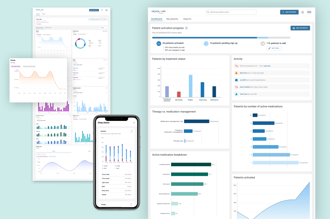
Headlamp’s Provider Portal had been serving psychiatric providers in guiding treatment decisions for two and a half years, but had received critical feedback from providers that “there was just too much” being displayed, and that it was “hard to know what information was actually useful.” Sales teams often complained that during demos with customers, they often felt there was just too much going on and that the useful information was buried behind tabs and drawers, which was extremely distracting for customers.
The problem
While psychiatrists understood the need for behavioral data to monitor and guide patient treatment, few psychiatrists actually used behavioral data because reviewing it added too much time to their workflows.
So, we decided to tackle the low-hanging fruit and improve design ahead of adding features, making improvements to information hierarchy primarily, to see if we could bring Headlamp's behavioral data’s value to the surface for Psychiatrists.
Our goal was to make it so that reviewing Headlamp's patient profiles wouldn’t take longer than 30 seconds to get high-level insights.
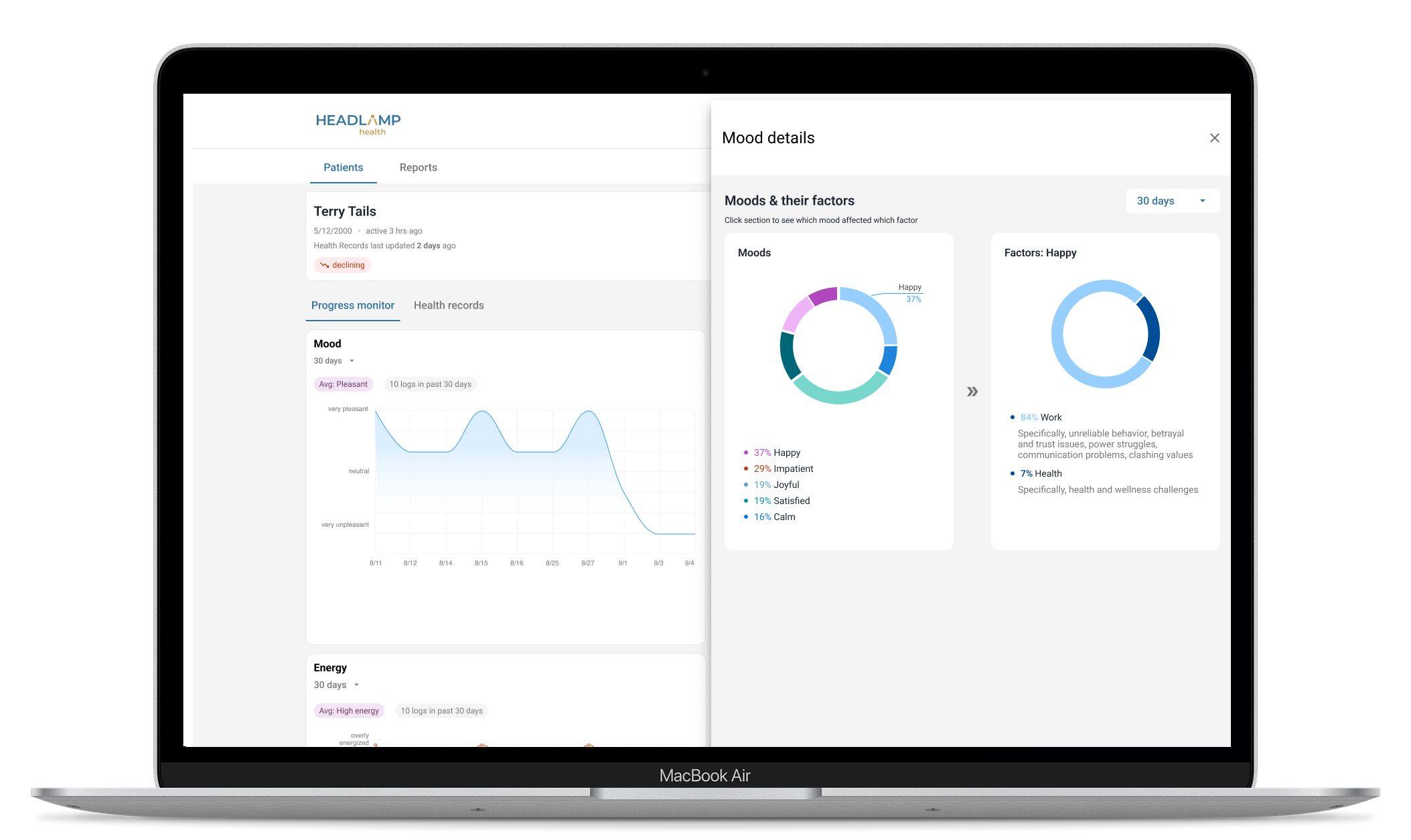
Who we were designing for and why they mattered:
1. Providers. Providers were not our most frequent users, but they were the primary decision-makers, so their buy-in was essential. More often their office staff would check Headlamp's portal for relevant updates and add them to the provider's EMR during appointment prep. If did login to Headlamp, it would often be to corroborate the patient’s anecdotal experience during appointments, so they would dig into Headlamp’s data, often alongside their patients.
2. Patients. Patients had no direct access to the provider portal, but without patient buy-in to using Headlamp’s Patient App, there was no data for providers to use. Most successful patient onboarding would take place with the providers showing the patient dummy data through the provider’s view so that the patient would understand why app engagement was important.
3. Provider’s Office Staff. While office staff made up over 75% of our user-base, they had little decision-making power in the Practice's tooling. However, making their lives easier was critical so that Headlamp's data would make it in front of Providers during appointment prep. Because they typically prep for appointments in 2 minutes or less, Headlamp needed to deliver high-level insights in under 30 seconds.
The core insights that lead to final designs:
1. The data visualizations needed to be self-explanatory for patients and providers, and office staff, in under 30 seconds.
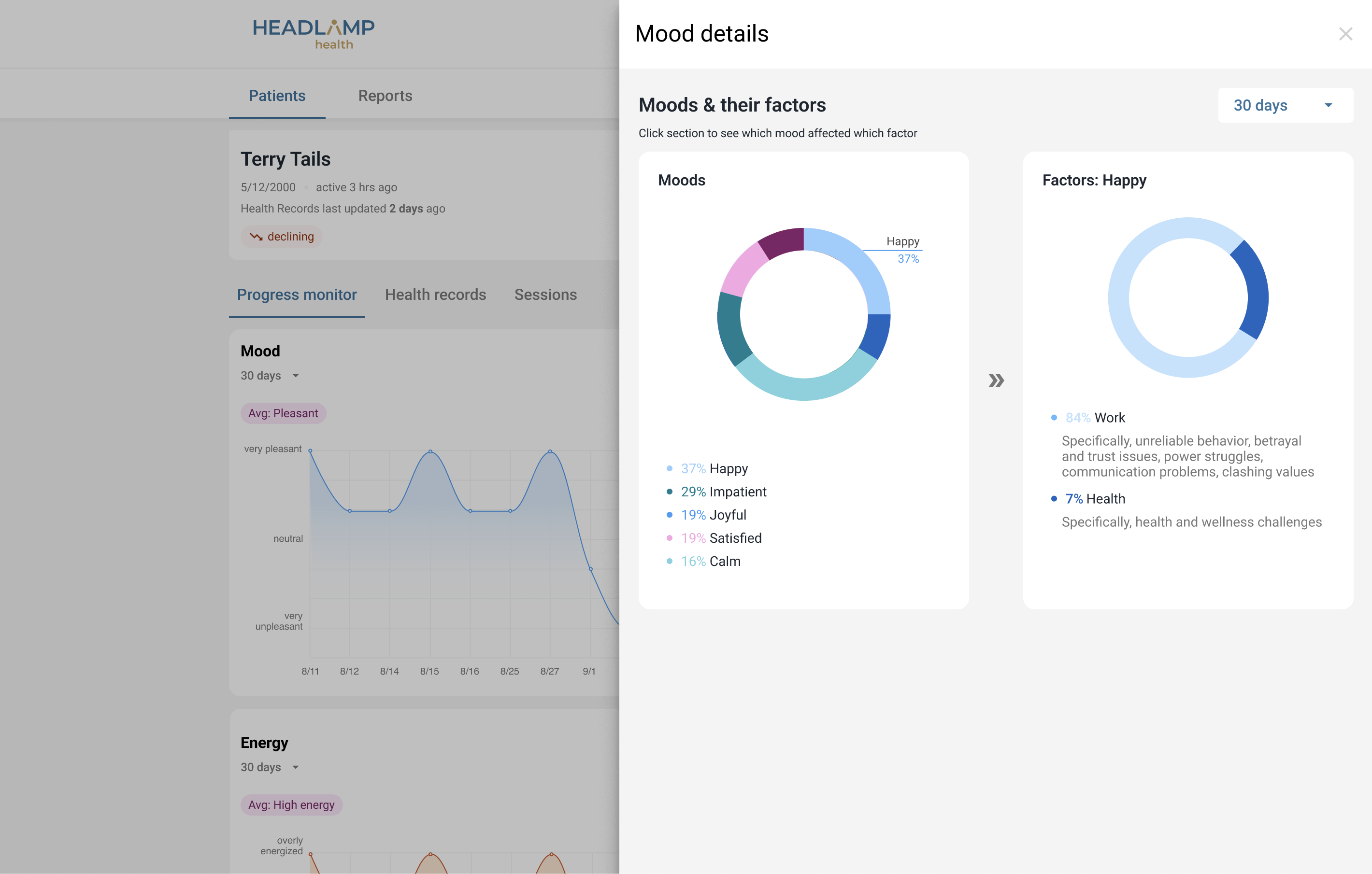
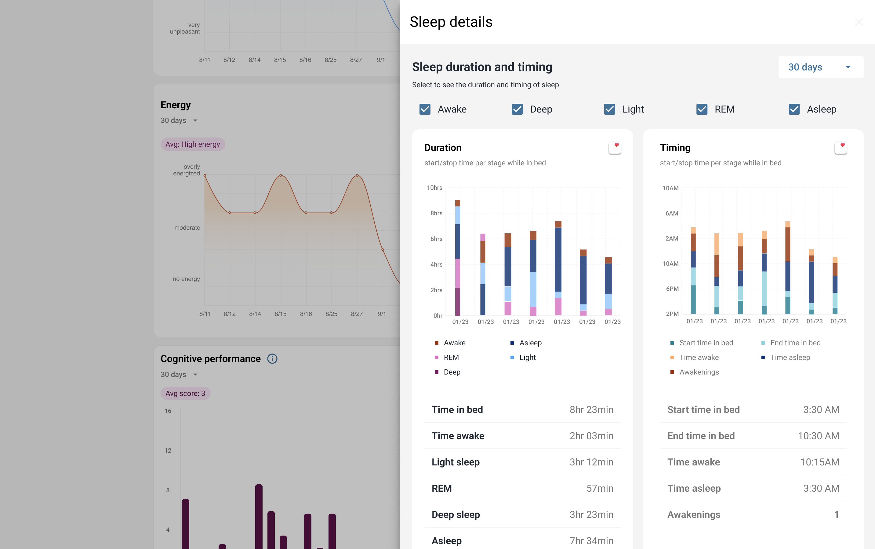
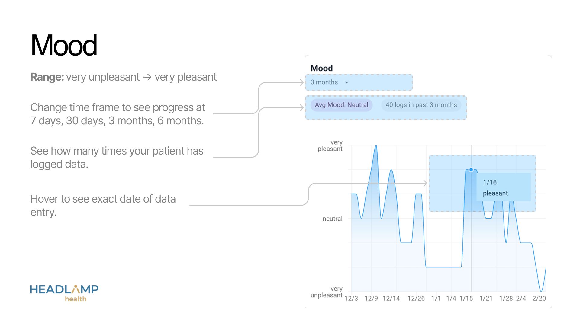
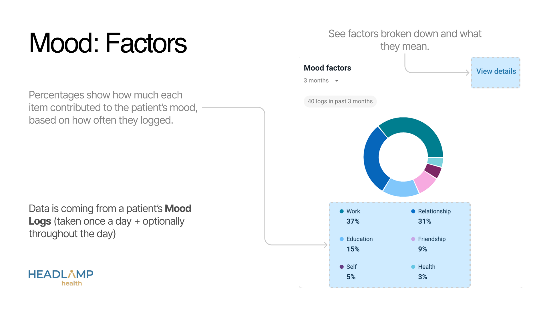
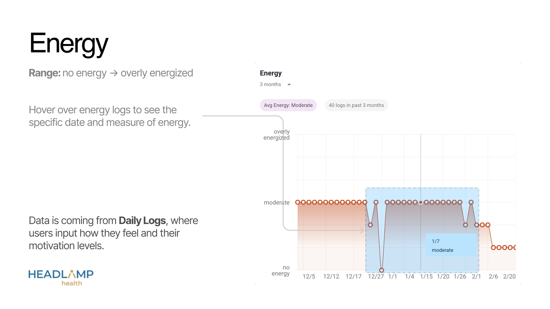
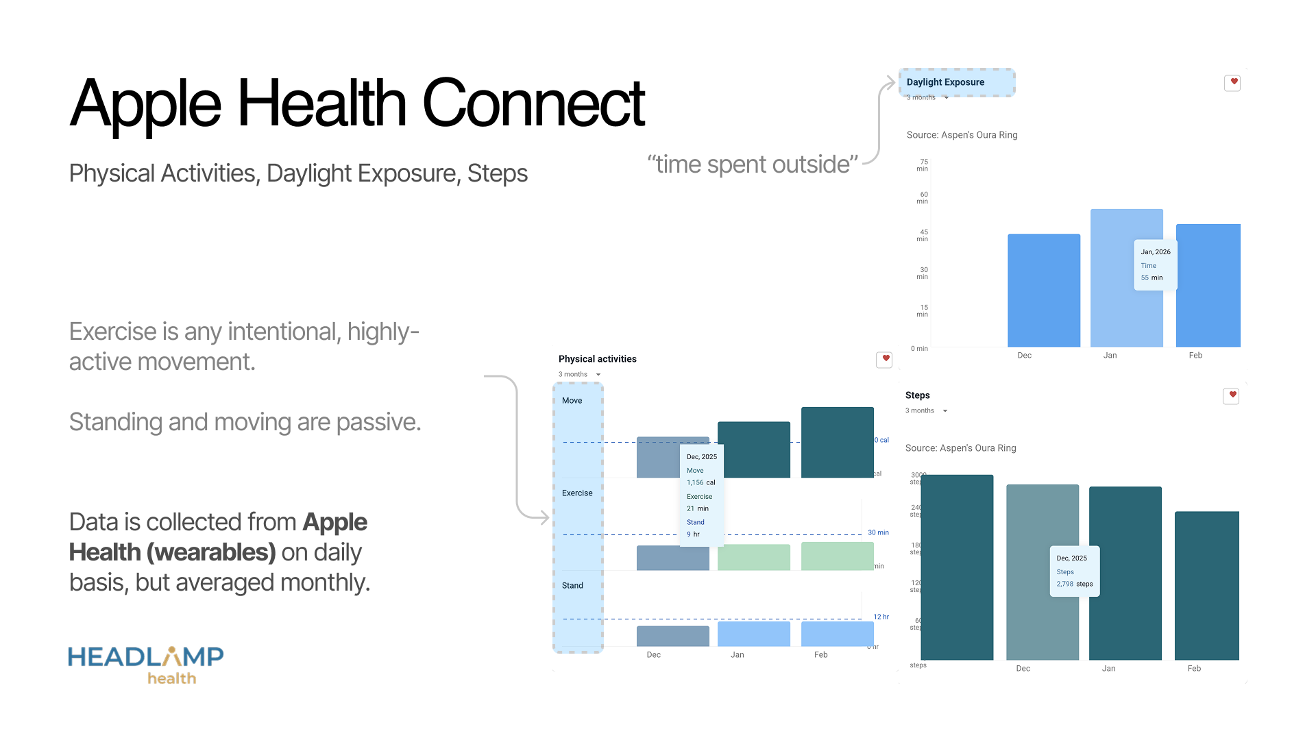
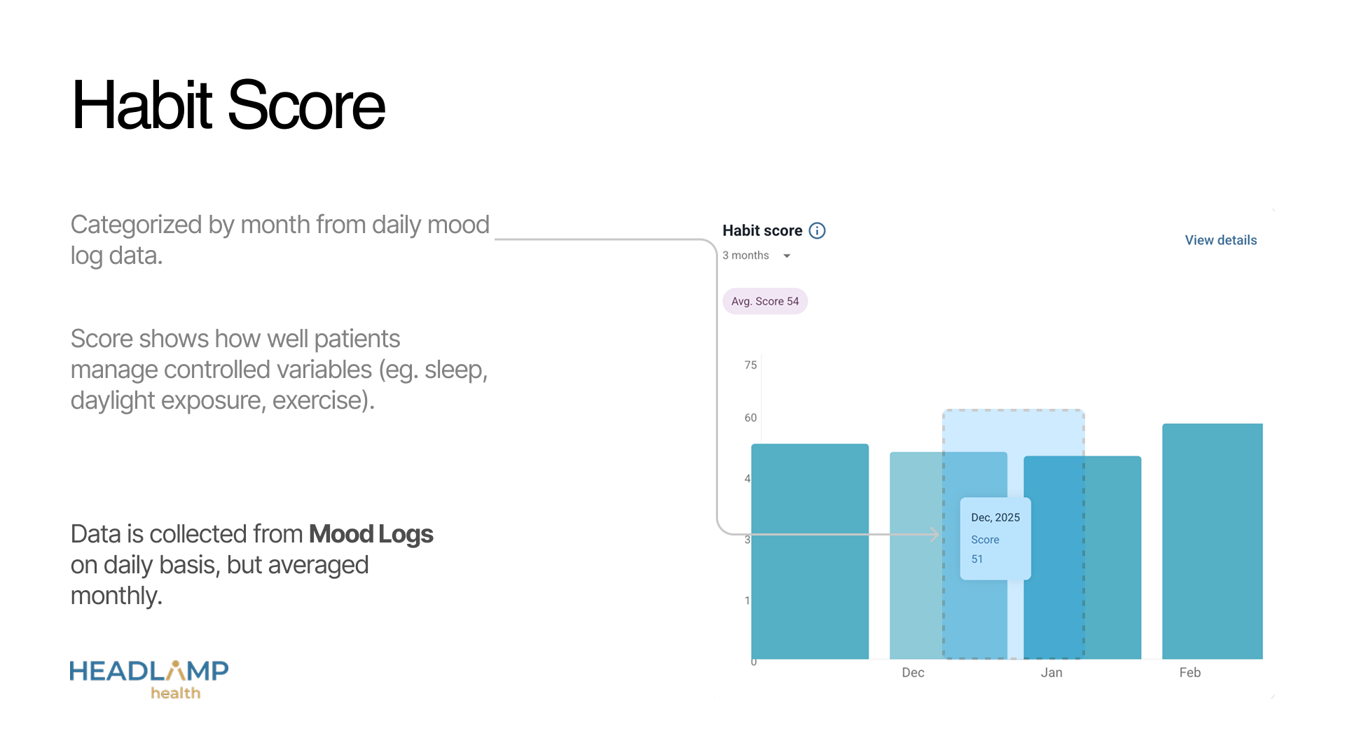
2. For appointment prep & in-appointment workflows, “less was more.” → Visualizations with hover effects and summaries were used throughout.
3. For billing and auth workflows, “more was more.” → Quick actions with ‘download PDF’ were added throughout.
4. Office staff always use desktop computers. Providers may use mobile devices, tablets, or desktops. Therefore, layouts should be responsive and easily navigated on mobile.
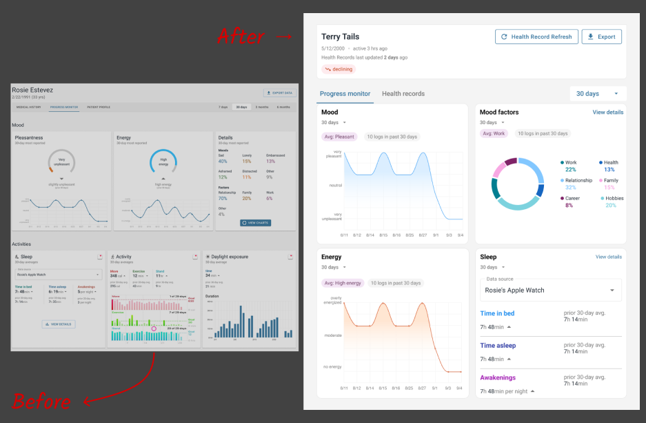
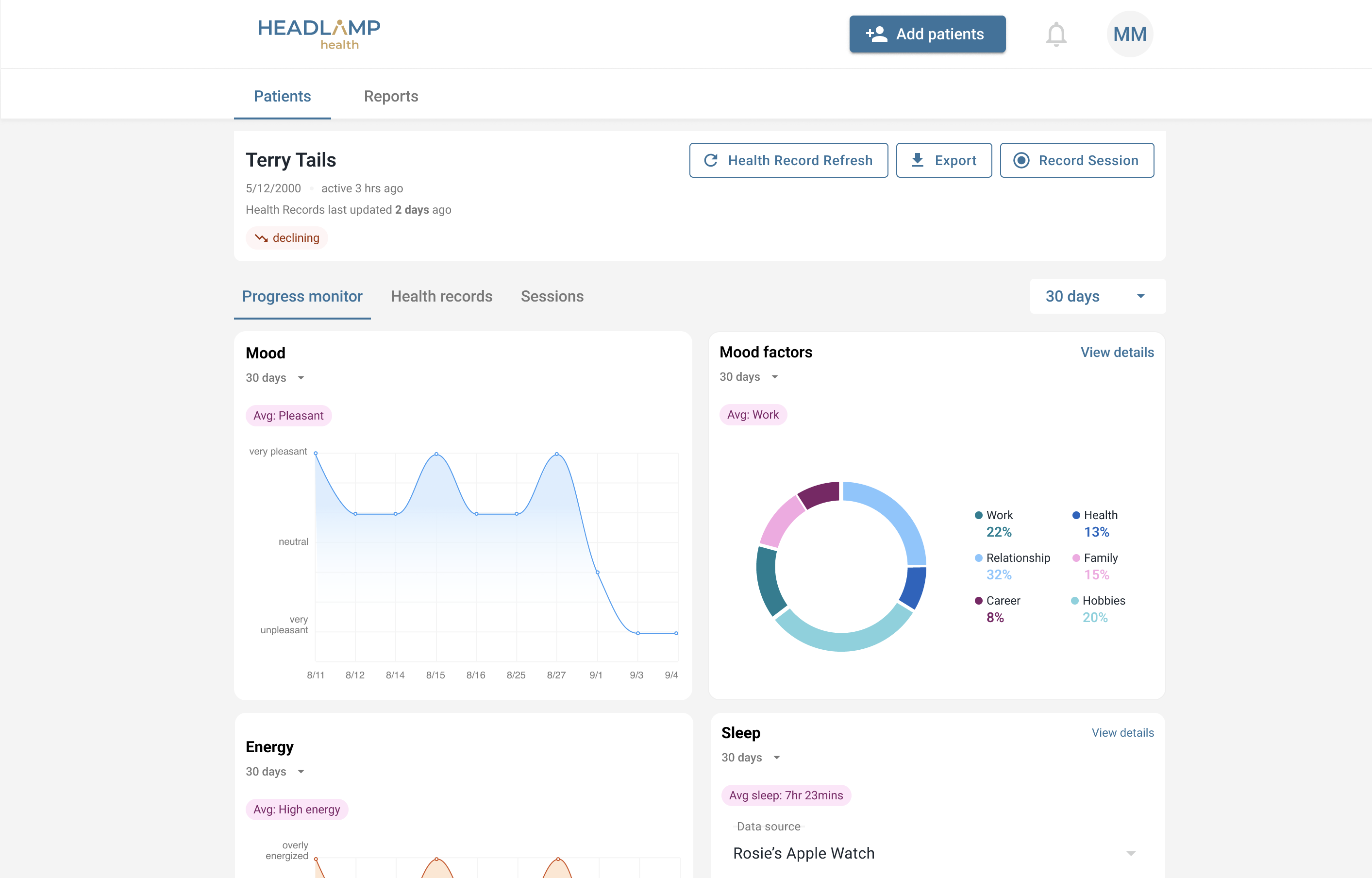
Our approach was to improve layouts & navigation to surface the important data for appointment prep first, cut the distracting or underutilized visualizations, and make the web portal responsive so that providers could view data from any device (including mobile or tablet).
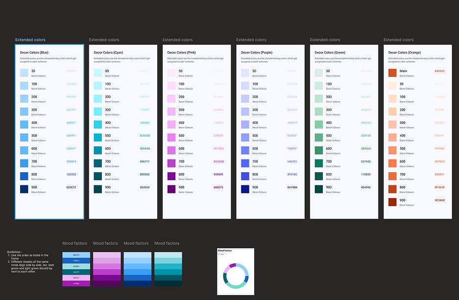
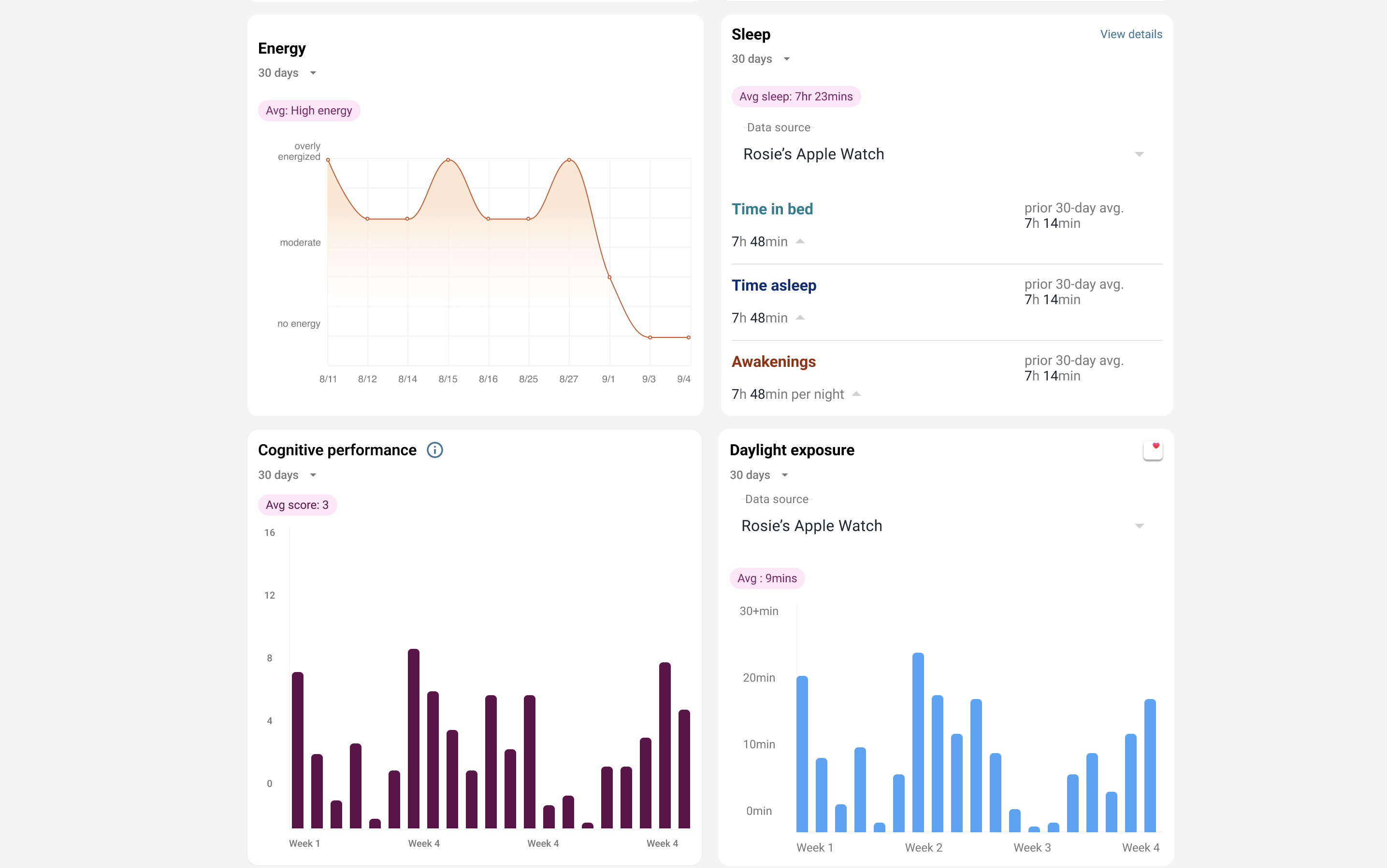
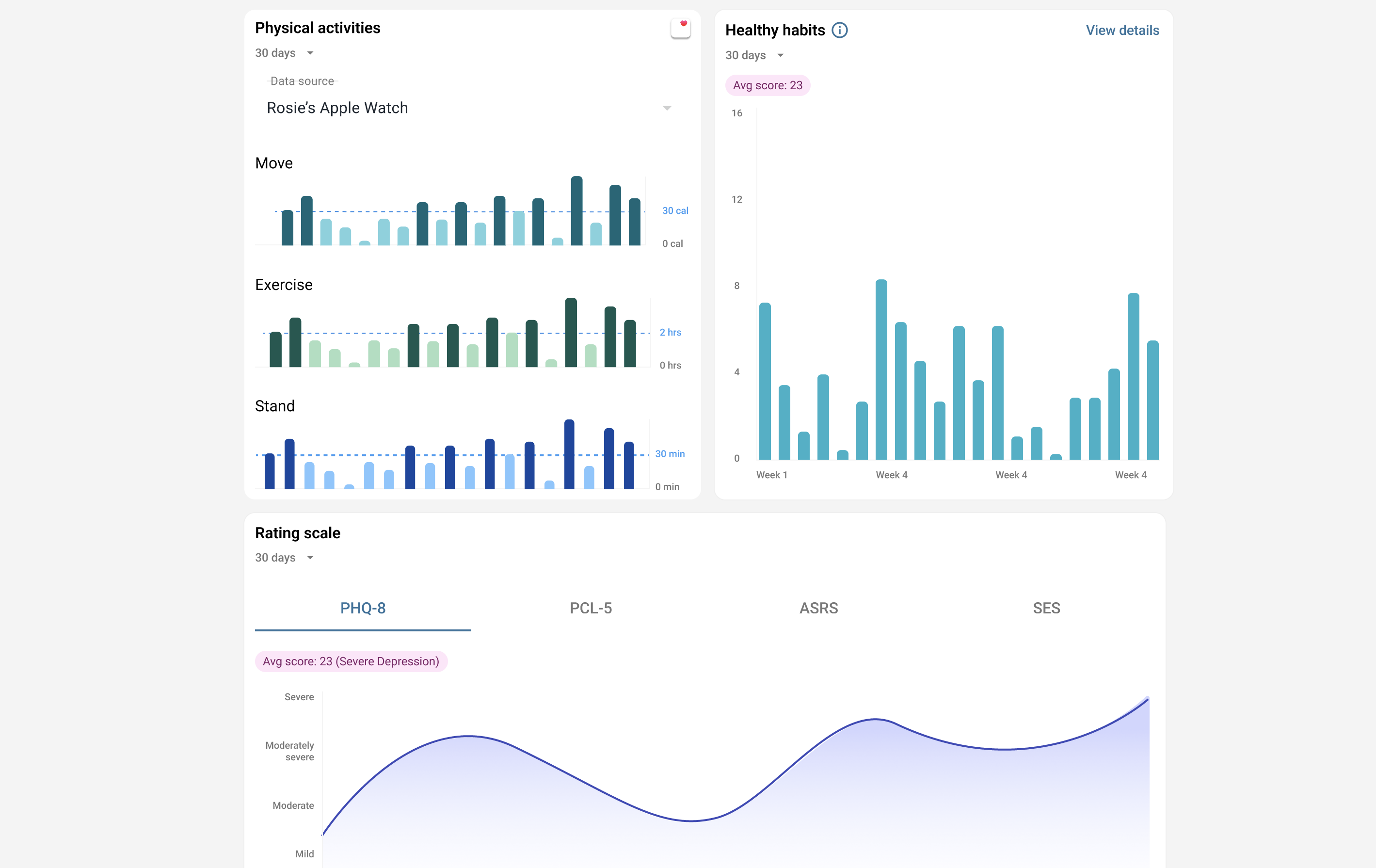
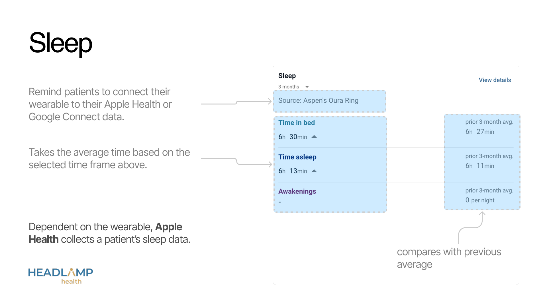
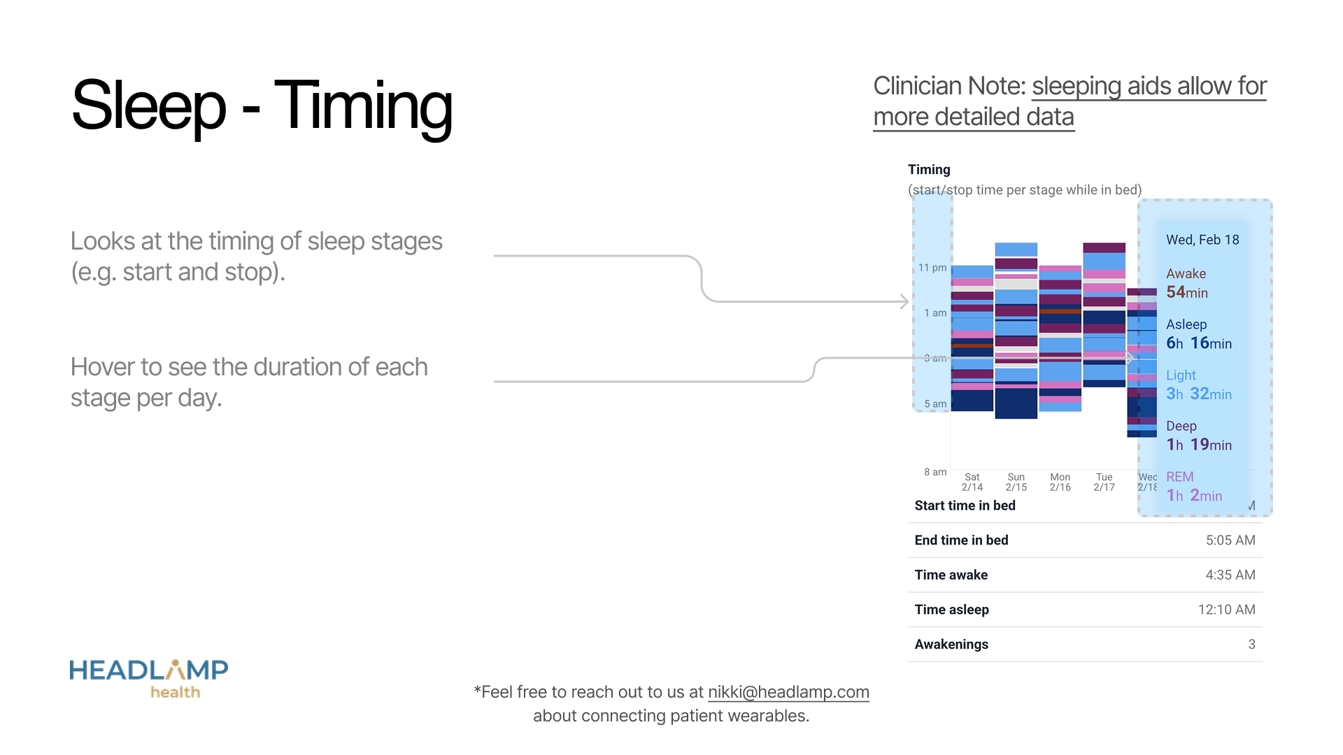
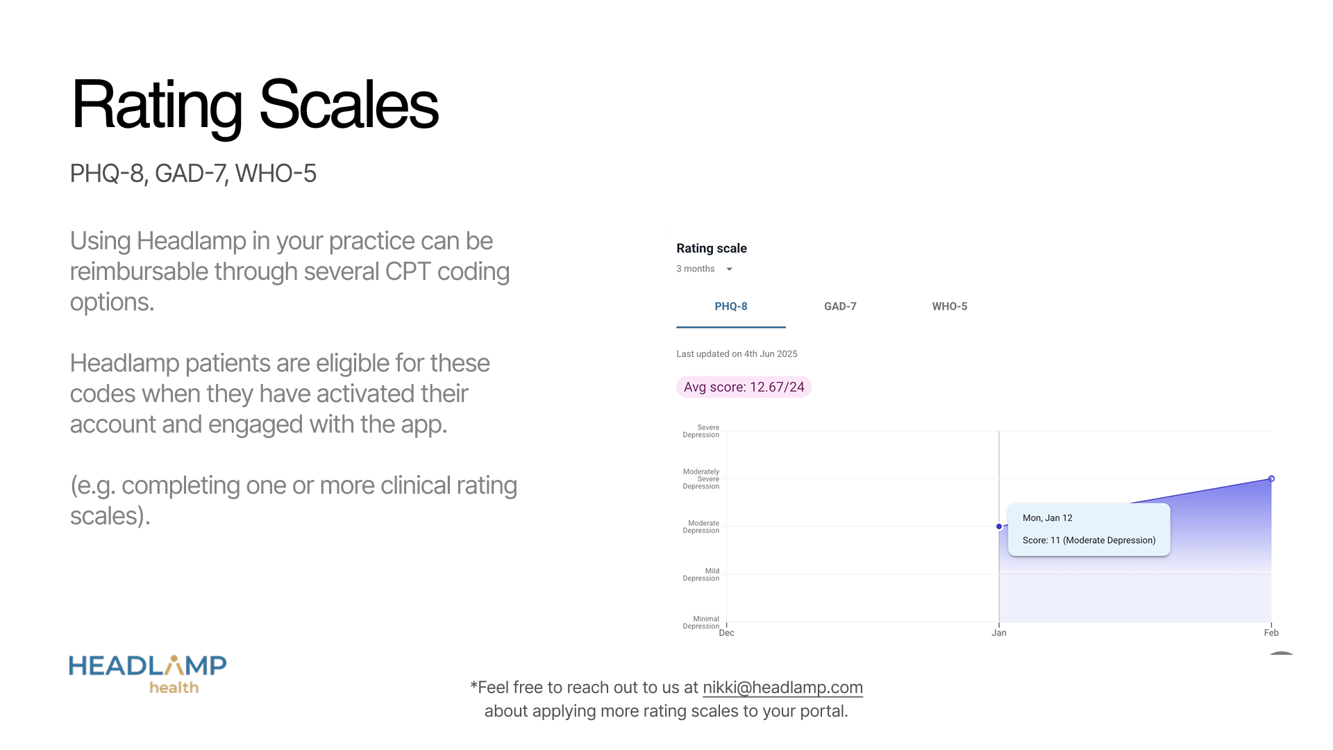
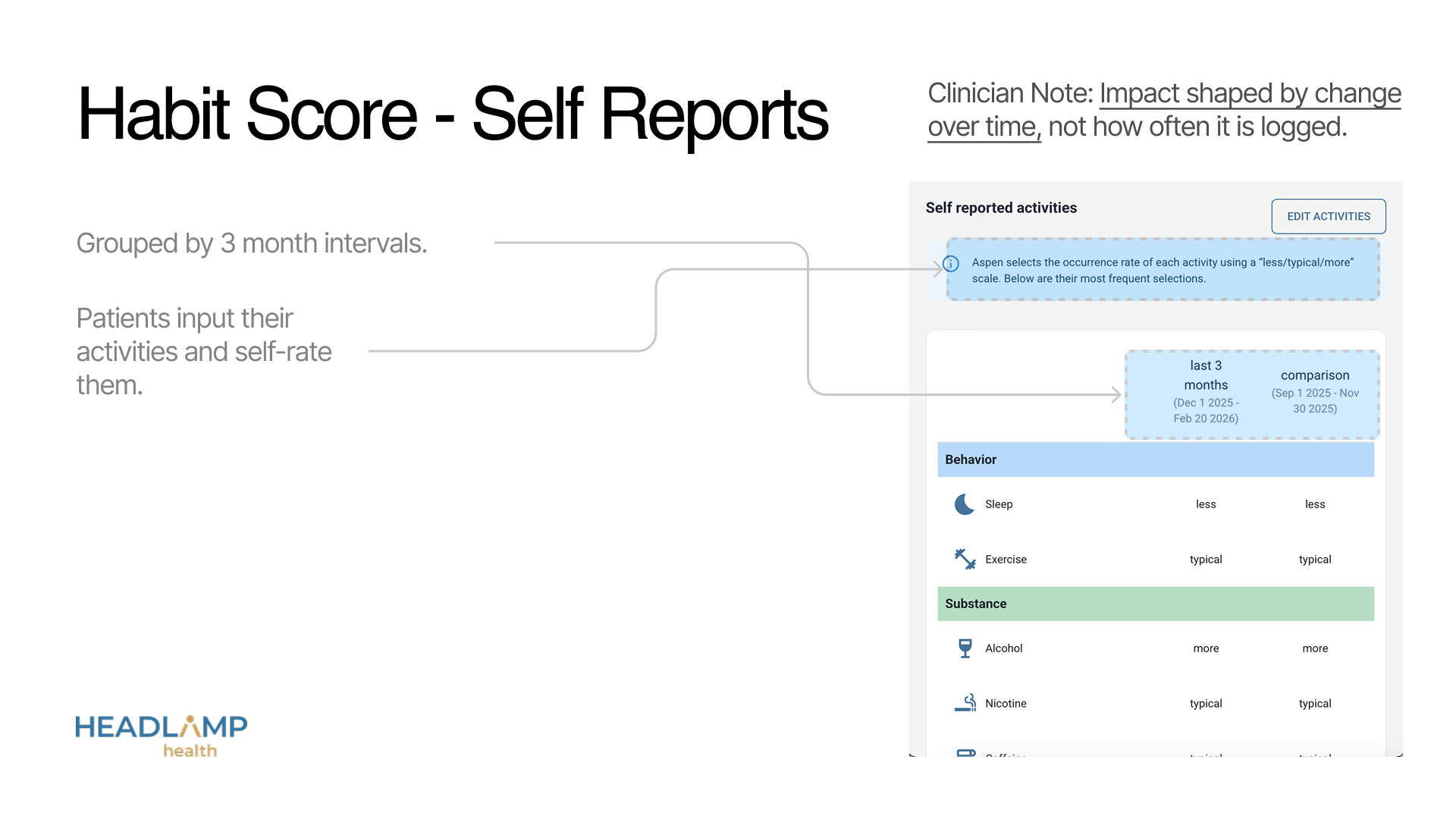
Research was conducted through provider interviews, 2 surveys, and reviewing UX cam sessions. All three research methods confirmed the prioritization of psychiatrists for displaying 1) Sleep, 2) Energy, 3) Mood. Those were promoted to the top of the screens. Medication history and recent labs & imaging were essential when the provider was considering changes to medications, or for billing and auth. So we made those quickly accessible under a separate tab. Visualizations that were under-rated for in-appointment utility by providers were deprioritized or cut entirely - like clinically validated personality quizzes or diagnostic rating scales.
The results
Our team's redesign effort created both some expected outcomes and unexpected outcomes. During sales demo’s we were able to increase conversion to sign up to 65% (previously 20%). We also began to receive customer-referrals. From the positive sales feedback and smoother demo’s coming from our sales team, the took the opportunity launch a self-service onboarding flow 3 months later with a free trial for new providers - something previously un-imaginable without Headlamp’s value being apparent from the first visit.
We knew we had been taking a risk cutting an entire tab of features & functionality from the portal, but to our delight the risk paid off. Our engineers were able to re-invest their time to increase performance for our core visualizations, reducing load time to under 3 seconds (previously 10 seconds at times).
Our final result was unexpected but we considered a huge win. Within the next 3 months once our portal had time to be adopted by new providers, we found that patient activation (from sign up) increased from 55% to 91%. These changes were observed before we made any changes to the patient app experience.) We believe this increase in activation was because the provider portal updates made getting patient buy-in for using the app more successful.

.svg)